Showing posts with label profusion. Show all posts

Tuesday, February 3, 2015

Seattle Seahawks Superbowl Makeup

I may not be a huge football fan, but I love the excitement that surrounds the Super Bowl each year.

Between the rivalries, delicious food, top notch commercials, beer, and entertaining half time show, I think there's something for everyone. If nothing else it's a good excuse to get together with some friends, eat some good food and drink some cold beer!

Even though I don't follow football closely, I do enjoy watching it. I don't have any favorite teams so I just choose my favorite team out of whichever 2 are playing in the game I'm watching.

However, I have a huge soft spot for Seattle because I have plans to move there within the next few years. I consider it my future home and for that reason, I am a supporter!

So this year I thought I'd show my support by doing my makeup in Seahawks colors.


Unfortunately as we all know by now, the Seahawks ended up losing in a nail biting ending. I was disappointed but then flipped my tv to the Puppy Bowl and let's be honest, it's pretty hard to be upset after that!


I think my favorite thing about this look is that it's almost entirely budget-friendly products!


On my eyes I first put down a base of Nyx jumbo pencil in Milk to make the colors pop
I put a mid tone teal blue from the BH cosmetics 120 palette (1st edition) all over my lid, leaving the inner corner bare
I put a dark navy blue in the crease from my Profusion black jewel palette (swatches here )
I added a bit more depth in the outer corner with the matte black from the Wet n Wild I <3 matte 8-pan.
I mixed some neon greens from the BH cosmetics 120 palette and applied it to the inner corner, bringing it down on my lower lid and blending.


The last step I did that I regret is I used the shade Sabbath from the Urban Decay The Black Palette to line my lower lash line.
Every time I use something from The Black Palette I am reminded that these colors just do not work for me. They go muddy immediately and the color blends away leaving just a blackened mess. This application was no exception.
The Black Palette was actually my first experience with Urban Decay, and I got it on clearance. I'm glad I didn't write off the brand after that experience because I read several reviews that echoed the problem I had.


Shades marked with a daisy were all the ones I used from this palette.


I really like this look.

To complete it I wore my favorite lipstick combination that I can't get enough of lately. More to come on that soon! It is also bargain brands, but unfortunately they were limited edition products.

with flash
So that was the look I wore to bring some team spirit into the game. Sadly it wasn't enough. Maybe next year!

As for the rest of the game, I enjoyed Katy Perry's half time show, especially Missy Elliot's guest appearance!
I also loved how everyone on my twitter feed was live tweeting the half time show. My favorite part was the fireworks and when Katy rode off on a the-more-you-know shooting star.
I think my favorite commercials were the Budweiser puppy commercial (of course!) and the Liam Neeson commercial. I will admit though I did miss quite a few, including the girl-power tampon commercial but I did hear about it and loved what I heard!

What was your favorite part of the Super Bowl? Who were you rooting for? Let me know in the comments!

Monday, April 14, 2014

Profusion Endless Jewels swatches

You might remember around Christmas time I bought a few Profusion palettes because they only seem to pop up at drugstores during the holiday season.

I never got a chance to talk about this one but I really wanted to share some swatches with you because the colors are so so pretty!


The outside sheds some light on what the inside looks like- it is a little booklet that has two levels of products inside.


The top layer looks like this and I'm sure you immediately see some great colors. My eye went straight to the mint green on the bottom, then gazed approvingly at the pink, purple, and navy shades.

This is the left side of the first row. Shimmery white, olive with a gold tint (Almost a khaki color) and a champagne.


this is the right side of the top row. More pale colors in the white/pink/cream family.


The 2nd row is extremely pigmented and includes some gorgeous colors.


The purple and blue from the middle row are so gorgeous!


This is the bottom row and you can see that beautiful minty color above. Ignore the bottom left color, I was trying to show a comparison to something but I don't remember what, ha!


When you flip open the top layer you can see the bottom layer which has 9 eyeshadows, 2 blushes, 6 lipglosses, and one crappy dual ended brush.

I must say I hate when companies put lip products and powder in the same area because the powder kicks up and makes the lip products gross. Luckily, I'm not a fan of using these types of lip products anyway so to me they are just a waste of space.


Here's a close up of the shadows because I'm so into the blue-teal shades!


yeah. they're beautiful.


It's hard to see the purple above so I included a second picture.


Here's the 2nd row of colors and the blushes. Honestly those colors look pretty similar to some of the colors in the top layer! The blushes are okay but nothing special to me. The one on the right is too orange or my skintone I think.


Here are swatches of the lip products which are not that impressive if we're being honest.

So this palette is one that I wish I could depot my favorites from and forget the rest. Even though all of the shadows are pigmented and pretty, I just don't have a use for most of them.

Overall, this palette was well worth the $5! If you caught it after Christmas was over, it was on clearance for even cheaper.

What do you think of this palette? Worth five bucks?!


Saturday, February 15, 2014

Valentine's Day Cut Crease FOTD

So as I am sure you remember, yesterday was Valentine's Day.

I am not going to get into defending this holiday because, I get it. A lot of people hate it.  But don't rain on my parade! I love all holidays! I love themes! I love red and pink actually no I don't which is why it's fun to like it on the holiday only! Hearts are fun! Chocolates are yummy!

You get the picture.

And it has nothing to do with the fact that I'm in a semi long term relationship. When I was in high school I was single as a nun and still had so much fun with it. I bought these super cheesy boxers with holographic hearts all over them and wore them to school along with wings and a bow and arrow and I ran around all day acting like cupid.
Sometimes I think of my high school self and ask, did that really happen? Yes, ladies and gents. It really did.
Which is why I don't buy the bitterness that people seethe out on V-day. I think it's fun to celebrate love- whether yours or someone else's!

SO as you may have learned by now, I like to do themed makeup looks that are over the top and utilize the holiday's colors (see: my Christmas look)

So for Valentine's day (which was mostly spent with friends as my man was working) I did an extremely colorful cut crease look.

I am still new at cut creases so it's still in a learning curve. And while I didn't take pictures for a tutorial because frankly I didn't know what I was doing, I still want to tell you how I achieved this look.


As you can see I did a red eyelid color (that really came across as more pink), with a purple cut crease and purple lower eyeliner, with a pop of bright pink in the inner corner.


The most dramatic part of this look is obviously the double/triple wing look. This is something that just kinda came about and I went with it.


So the first thing I did was prep my eyelids with Urban Decay primer potion + a coat of Nyx Milk to help the eyeshadow stand out.
Next I took out my BH cosmetics 120 palette and used the red color pictured above -marked with the daisy- and patted it all over my lids.

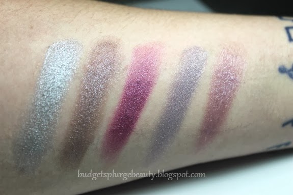
After that I took my MAC 212 brush to create a crease with the purple color marked BELOW from a Profusion palette that will be covered on this blog very shortly- consider this a sneak peak!


I was very careful to blend only the slightest bit as I didn't want to mess up the crease.

With the 212 I extended the crease to create a wing upward and then extended the red out as well.


Above the crease I blended out the purple color seen here. It seems really dark but it actually turns out to be a fairly light color. I think these 2 shades of purple blended perfectly together.

I forgot to mark it with a daisy but the pink that is 4 down from the red- that is the pink I used in the inner corner.

I again took the 212 and took the dark purple I used in the crease and ran it along my bottom eyelid. I extended it out to match the wing above it, creating a really interesting effect that I'm not 100% sure I liked.

Finally, I highlighted my brow bone with Virgin from the Urban Decay Naked palette.


Other products I used in this look are:
Mary Kay Time Wise matte wear liquid foundation in Ivory 7 (review of this coming up! this was the first time I used it! What do you think?)
Physicians Formula translucent multi colored pressed powder
eyebrows are the brown shade from the Wet n Wild I <3 Matte 8 pan
Covergirl lash blast volume mascara
E.l.f blush & bronzer duo in St Lucia for contouring
and Maybelline Superstay 24 hour lip color in Endless Ruby --I think. The label has completely rubbed off so this is just my best guess.

So did you guys do anything exciting for Valentine's Day? I didn't yet- I am going out to dinner with my guy tonight to celebrate. He also got me roses and Season 2 of Pretty Little Liars (a man after my own heart, huh!)

I hope you all had a great holiday and didn't get too bitter. Love is all around us and there's no reason not to celebrate it!


Friday, February 14, 2014

Profusion Neoperle eyeshadow palette (green version) : swatches & review

It seems like forever ago that I first talked about the Profusion Neoperle eyeshadow palettes.

and I know it's pretty far after Christmas so it may be hard or even impossible to hunt down these shadows. But I just feel like they are worth talking about.

As you can see they look the same as the blue version, just obviously green. 

Coming in at just $2 a pop, and housing 15 eyeshadows, you can't really go wrong. 

When I opened it my eyes zero-d in on one particular shade- can you guess which one it was??


I'll give you a hint: it's not a neutral!

The 2nd shade from the left, in the middle row is one of the most gorgeous colors I've ever seen.

It's a mint green hat has a beautiful golden sheen to it. The color is truly unique and very pretty.


The rest of the colors were your standard earthy tones. I also like the 2nd to last one on the bottom row.

I will tell you the one thing that was wrong with this, and you can see it in the picture above. It was really sloppily glued into the cardboard palette. Of course, it felt cheap. It was uneven. However this really didn't bother me. I mean, for $2? Wasn't expecting great packaging. Not a deal breaker for me. You get what you pay for, right?


I personally feel like the one mint green shadow was worth $2 all on its own. The rest were just bonuses!


In my swatches there is a strip of primer down the center. Since I prepared this post a while ago I can't remember if I used UDPP or Milani primer. But you can see the outline of where the primer is in most of the swatches. As with most swatches, they look better over primer. Brighter and a bit foiled.
However you can also tell that they are pretty pigmented on their own as well!
These swatches were done with a few back-and-forth motions as opposed to a one-swipe type of swatch.


Beautiful 2nd row. I am obviously smitten with the mint, and I really like the one in the middle as well.


So beautiful I had to include it twice.


I feel like this row embodies the jewel-toned mindset of shadows. You can barely even tell where the primer starts, because it is so pigmented on its own. Has a great finish and is very pigmented yet blendable as you can tell at the edges.


Here is after I wiped my arm with makeup remover a few times..as you can see most of the shadow is gone except for what was clearly on top of the primer. Which leads me to believe that these shadows, when on top of primer, have some GREAT staying power!

Did you get a chance to pick up any Profusion shadow kits this holiday season? What do you think of these colors?
There will definitely be many looks that I use that use these shadows in the future!


Tuesday, December 17, 2013

Profusion Neoperle Palette (blue) review & swatches

I was perusing my local Walgreens last week when I started eyeing all the holiday gift sets that were out.
I have to admit- I hit the jackpot!
I found every thing I was looking for! And more! Such a great haul. But instead of doing a haul post I love all the products so much I want to just post a review/swatches of each product!

So basically this product falls under the "more than what I was looking for" category. I didn't even realize it existed. I was looking for some $1 Profusion products I had heard about and stumbled onto this instead.


Priced at $2 and sized a little smaller than a checkbook, this little palette or "journal set" packs quite a punch!

I have no idea what a journal set is, and I have never heard that in reference to eyeshadows. But ok, Profusion. You keep doin' yo' thing.


That's right, 15 eyeshadows for $2! I literally could not say no to this deal.
[moment of realization. This is actually not the first palette I bought. Notice the title says (blue). This palette also comes in 2 other colors. I first bought the green one and was so impressed I HAD to go back out and get the other two.]

Anyway, I couldn't wait to get home and swatch these shadows!

Full disclosure about these swatches: they are not one-swipe swatches. I do not find those to be accurate considering when I put on eyeshadow I don't expect to only use one swipe. Also, half of the swatch is done over Urban Decay primer potion and the other half is over bare skin. As you can probably see, though, you can't tell at all where the primer is. So while the primer would help to keep the eyeshadow on longer, it does not do anything for pigmentation.


As we start with row 1 you can immediately see that these shadows are super pigmented. The shadows themselves are so soft- maybe even a little too soft. But they are silky smooth. Look at that blue! So bright!

Since my camera only focused on the first 2 shadows in the first picture here's another picture with the focus shifted to the last few shades.


Row 2 of this palette includes one of my favorite colors- the third one. So pretty! :)


Come on! Look at these colors! THEY'RE SO GREAT!

Again with the focus issue so here you can see the second shades better.


Ughhh look at these babies!

All in all- while I wouldn't call any of these shades groundbreakingly original, they are so, so freaking pigmented!
And all for only $2? Consider me sold!

I really urge everyone to try and go out and find these palettes. There are 3 different colored packagings, and I have reviews coming for all of them!

What do you think? Is this palette worth $2? Are you gonna try and find these at Walgreens?
Let me know below!

Follow your bliss,
Ember Darling

p.s. I am changing something MAJOR about my appearance this week! o0o stay tuned to find out what it is!
OR head over to Budget Splurge Beauty's Facebook to see it first, before the blog! ;)

Wednesday, December 11, 2013

Smoked Crimson Eye Makeup FOTD

Here's a look I threw together one night while messing around with some makeup I had never used before.


I have a simple pictorial and the eyeshadows I used but I don't have any of the other products I used that day. Sorry!
However I think this pictorial really highlights the fact that when it comes to makeup- it gets worse before it gets better. Hah. At first you look like a mess and ask yourself, what am I doing? But you keep trekking on and in the end you are left with something you can be proud of! Looking at the first pictures in this compared to the final product proves my point.

The first thing I did for this look was covered my eyelids with Nyx's chubby pencil in Milk. If you are a beauty fanatic and haven't heard this trick, you must live under a rock! Putting a white base first helps boost the pigmentation of eyeshadows that are too sheer on their own. Plus they are a little sticky to help it adhere better.


I swept the nameless color - so I'm calling it crimson- all over my lid. The coloring in this picture isn't the best. The pigmentation was a lot better in person.


Next I loaded the 2nd darker color onto the top of the lid. I was experimenting with different color placement...this isn't normally how I do my eyeshadow FYI haha


Next I blended out the two colors and added a highlight, then added the rest of my makeup.


The first color I used in this was this coppery red shade (marked with a daisy) from this small compact palette. It's called "Halo-the palette" from Profusion. I found this little guy on clearance for, like, 60 cents after christmas last year at Walgreens. I bought a few of them since I figured why not? So cheap! And, plus side, they don't suck! They aren't the greatest but I have no complaints, particularly for the price.

It's funny that I'm finally posting this (belated) post featuring Profusion when I have quite a few more Profusion goodies coming up!


For the crease I used the definer color in the Wet n Wild Comfort Zone palette. I need to get better pictures of this because it has a beautiful duochrome that didn't really show up in pictures.

So that's that. Just a simple look I played with one boring night, using all very cheap makeup products!

What do you think? 

Follow your bliss,
Ember Darling
EmberDarling